How to generate graphs from the Database of Adverse Event Notifications.
The easiest way to get started is to download the excel spreadsheet and download and unzip the DAEN scrape update (updated most weekdays). Alternatively, if you are not keen on opening an excel spreadsheet from a stranger on the internet then you can follow along with the instructions further down to re-create the spreadsheet yourself.
Once you have the spreadsheet and latest DAEN scrape, open up the spreadsheet 'AccAEN_pivot_table.xlsx'. In excel go to 'File', 'Open', 'Browse', change the file type selector to 'All Files (*.*)' and select the latest scrape update file 'DAEN_webscrape_listofreports_v2.txt' and click 'Open'. Normally you should just be able to click 'Finish' in the Text Import Wizard, but if there are any problems, the things you need to know are that it is a delimited file, the delimiter is tab and that the second column is a 'Date' in the 'DMY' format (all other columns are 'General' format). Once open click on cell A1, press CTRL+A to select all, then CTRL+C to copy. Go to cell A2 in the 'Instructions' workbook of 'AccAEN_pivot_table.xlsx' and press CTRL+V to paste the latest scrape data in. Click on the 'Graph' workbook (tab at the bottom of the spreadsheet), right click somewhere in the pivot table (cell AA1) and select 'Refresh'.
You can now use the pivot table and graph. Select the symptoms you are interested in, drag the PivotTable elements to and from 'Rows' to set the x-axis, 'Columns' determines the elements that make up the stack in the column plot and 'Values' is what is plotted (Count of Symptoms).
To recreate the spreadsheet yourself
Open 'DAEN_webscrape_listofreports_v2.txt' as described above, but instead of copying everything, save it as a new .xlsx file. Highlight A1 to G1, then right click on the selected area and select 'Insert…', select 'Shift cells down' and OK. Enter the following in A1 to G1: ID, Date, Age, Sex, Medicines, Symptoms, Vaccine. You should now have something that looks like this:
Select the whole of column A to G by clicking and dragging from the column A label to the column G label. Click on 'Insert' in the top excel menu and 'PivotChart' (in the Charts group). It should have selected the 'Table/Range: DAEN_webscrape_listofreports_v2!$A:$G' and it will be placed in a 'New Worksheet'. Click OK.
A new worksheet has been created called 'Sheet1'. In the 'PivotTable Fields' box on the right drag 'Symptoms' to 'Values' and drag 'Date' to 'Rows'. In the pivot table you will see 2021 and 2022 with little + symbols next to them. Click on the + for 2021 and 2022 to expand it out. Right click on one of the Qtr lables and select 'Remove Quarters'. This should now show months.
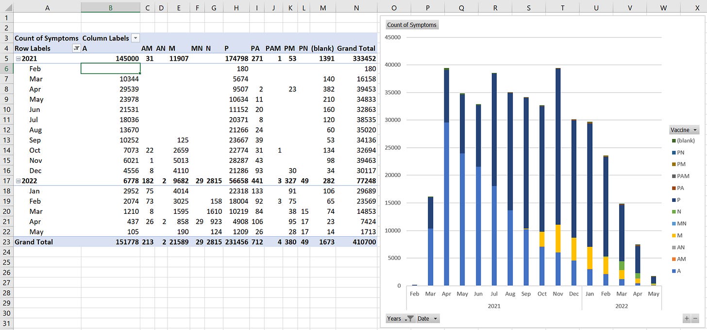
Right click on the cell that has <22/02/2021 and select 'Filter', 'Hide selected item'. Right click on the graph and select 'Change Chart Type…', then 'Stacked Column' and 'OK'. Now in the 'PivotChart Fields' drag 'Vaccine' to 'Legend (Series)'. The worksheet should now look something like this:
Click somewhere on the PivotTable (for example cell B6), click on 'PivotTable Analyze' in the top menu then 'Insert Slicer', tick 'Symptoms' and click 'OK'.
Now to make things more readable, I inserted columns by selecting column A to column Z, right click and insert, then dragged the graph and symptoms selector back to where I wanted them and resized as shown below. It should now look something like this:
If you click on the pivot table you can drag items in and out of the Rows (the x-axis) and Columns (the stacked groups). For example, drag 'Years' and 'Date' out of 'Rows' and drag 'Age' in to 'Rows'. Then drag 'Vaccine' out of 'Columns' and drag 'Sex' in. You will end up with something like this:
I wonder if you can spot any issues with the COVID-19 vaccines in this data set. Apparently the TGA hasn’t seen any safety signals worthy of halting the vaccination program (but to be fair, the TGA has done a great job of closing their eyes, sticking their fingers in their ears and shouting 'I can’t detect any safety signals' as loud as they can).


